Digital Skills: Illustrated Vector Map
- Poulomi Sen

- Sep 22, 2020
- 3 min read
Updated: Nov 29, 2020
PRE- TASK
A few days prior to the commencement of the project we were told to make a hand drawn map of any locality. I chose my school areas as it holds a special place in my memories.

On our first session we were told to jot down some feeling that we want to portray in our vector maps. The themes that I listed were as follows:
Joyful
Nostalgic
Childhood
Energetic
Innocence
From the point of view of a child
We has a very insightful discussion with our tutor about our progression into the project and certain tools that can be used to achieve the desired vector map. Some suggestions made by my tutor are as follows:
Color
Lines
Scale
Icons
Representation
We ended the session with some clarity about the course of action in this project. Its an exciting feeling when you don't know what the outcome is going to be but you put your 100% in whatever you do and let the work take its own shape.
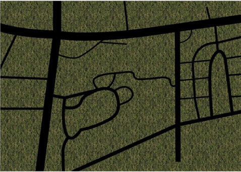
Line Map


Making the line map was not a hard task as we had to just trace the hand drawn map on a digital medium.
Icons


When I started making the icons I wasn't sure what to make therefore I browsed through some references to get an idea. After getting my first attempt at icons reviewed by the tutor I was told to explore more. I then went ahead and made the icons on the basis of my associations of the place to an object. The swimming pool icon was inspired by the same; as a kid I was literally thrown in the water and taught to swim.
Texture Swatches


While exploring textures I thought it would be a good idea if I first downloaded the texture pattern and then try it on one by one on the map.


I really wanted to go with the texture pattern for the background but after trying it on the map I was not getting the desired outcome so I decided to work otherwise. Out of all the textures i was really content with the road texture and carried it forward as well.
Color Swatch, Color Theme, Texture


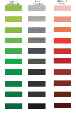


While exploring with textures on color, I came across a texture pattern (Craquelure) which looked very similar to the road texture earlier explored. I decided that this would be a better alternative for the roads at it would reduce the glitch/lagging of the software due to multiple files, giving very similar results.
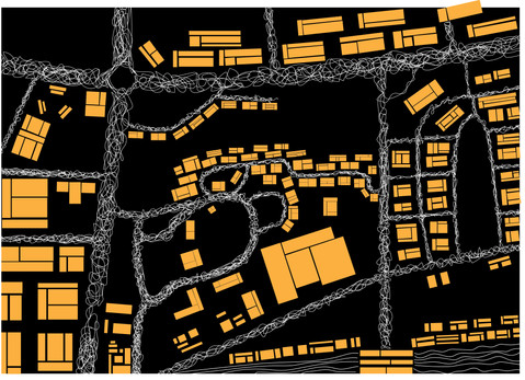
Compilation
Yellow being a color I associate the most with joy and childhood, I initially started with it. After trial and error I decided to work with more darker shade which will keep the 'joyful and childhood' aspect of the map and add on to the nostalgic feeling I was aiming for.


I remember, as a child tress and grass was something we most enjoyed and the area I was trying to capture had a lot of it too, therefore I decided to add tress all around finishing my map.
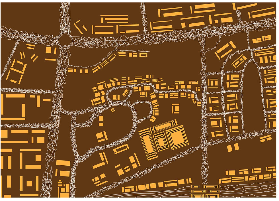
FINAL VECTOR MAP

Feedback


Abstractions
Initially I versioned my abstraction to be a mixture of lines and circles which would enhance the mood of the original map as well. While working with the original abstraction I got another idea to work with the map in another way therefore I changed the look of the map entirely.


After trying out various background colors I was most content with brown as my background because it gave the abstraction a very earthy look which was to my liking. I tried to make a point of emphasis by adding multiple squares within one square .
FINAL ABSTRACTION
Rubrics and Feedback:


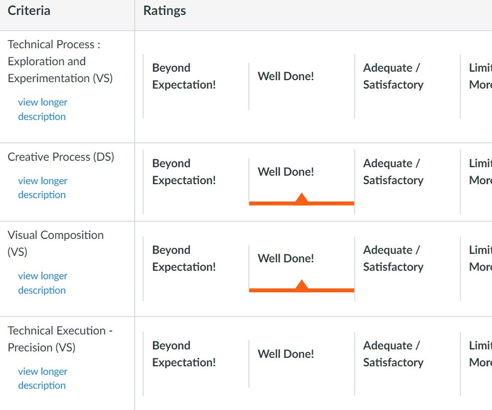
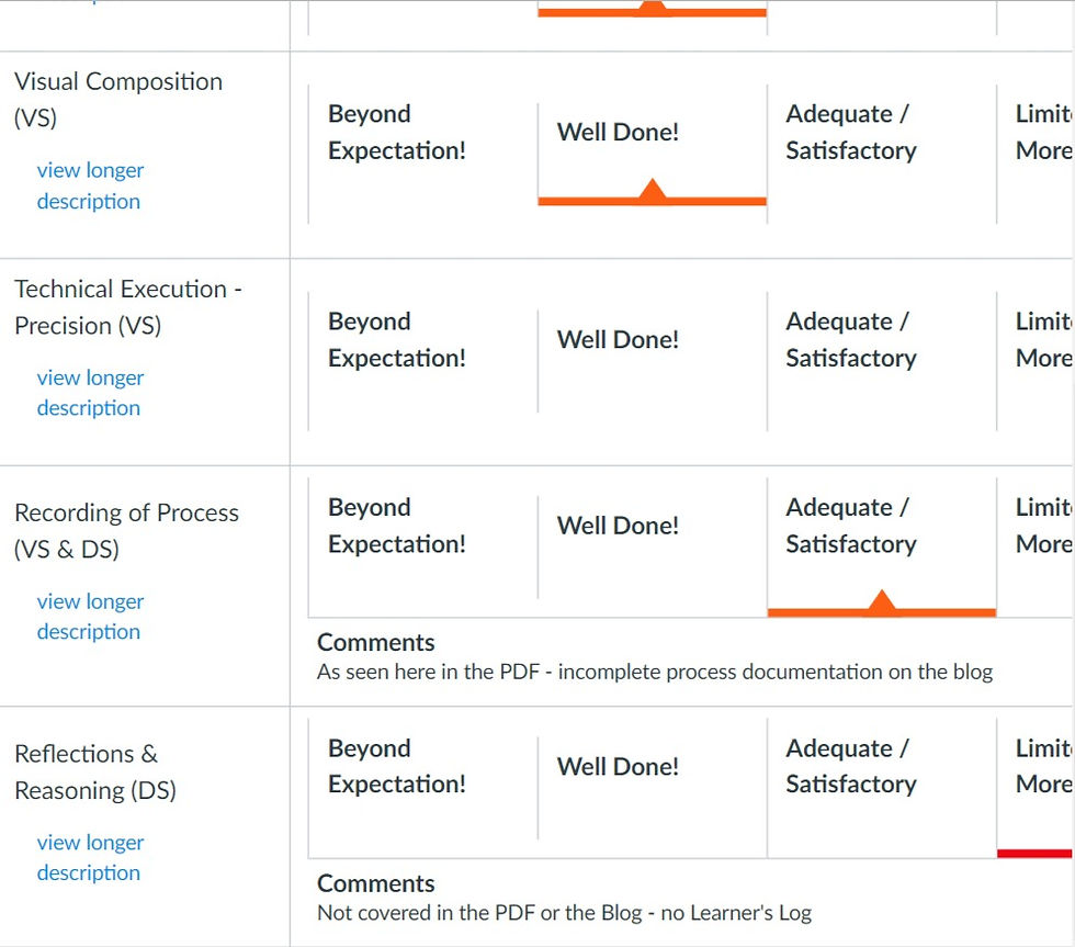

Comments