Project: Essence Of Color
- Poulomi Sen

- Sep 8, 2020
- 12 min read
Updated: Nov 29, 2020

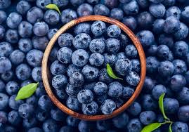
(Reference: Pinterest)
Pre-Task
Color! What a deep and mysterious language, the language of dreams. You can never judge a paint hue by the liquid color in the paint pot; you must apply it to the wall, wait for the paint to dry, then decide. Walking into the bright world of color was our next awaiting project, to guide us into the exploration of the underlying essence of it. Prior to the project, we were given a brief to collect 25 samples; physical as well as digital, can be a movie character or a flag or anything of universal acceptance for the color assigned to you. For me it was one of my favorite colors 'Blue'. Sounds easy, but when I actually got to finding the objects it felts like a never ending loop. I quickly learnt that there aren't many natural blue objects around us and most of the things are man made. After crossing this hurdle I somewhat managed to get 25+ object.


DAY 1
Task 1: Color Extraction
For our first 'official' day on this project we had to take the objects we had hunted for and make swatches of the exact shade of the color of the object/character/flag/etc. On our agenda today was just to make swatches for 10 objects, but who knew getting the exact shade of the color is much harder than it sounds.


DAY 2
Task 1: Color Extraction Continue


Task 2: Color In Sight

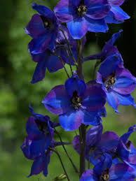
(Reference: Pinterest)
This line in the video we saw really stuck by me: 'each color evokes its own message'. As discussed in the video the cheetah print made for the athlete evoked a message of intimidation whereas a red color in the nail polish evoked a message for strength and power for a women. Big brands also use the illusion of color to mess with the subconscious mind of the customer which might impact the sales of the company and its products. If we were to connect this to our own lives, we sometimes don't buy certain things just because the color doesn't seem appealing. In our class today we had a discussion about how princess Diana was boycotted just because of her choice for wearing black color, even though black is considered bold the cultural aspect resulted in a misunderstanding. Different colors hold a different emotion and can uplift our mood as well as make us feel drowsy. Colors carry deep meanings with them in every culture. Western, Far Eastern, Middle Eastern, Indian, and African cultures have stark differences in the symbolism of colors within their cultures. For instance, in some cultures, white represents innocence, but in others, it can represent death. The symbolism of colors often stems from religious, spiritual, social, or historical events. In the Indian culture, red is associated with a bride in a marriage as well as with goddess Durga whereas blue is associated with lord Krishna. White is the absence of color and is the only color widows are allowed to wear. It is the acceptable color at funerals and ceremonies that mark death in the family. It reflects the essential quality of the color itself, when a widow wears white, she disconnects herself from the pleasures and luxuries of active and regular participation in society and life around her. Saffron is a sacred color for Hinduism as a religion . Black is denoted as darkness and evil; however, the perception of these colors are not necessarily this, but every culture has their own perception and understanding.
DAY 3
Task 3: Exploring Color Association
Group Mind Map

Group Members: Suditi Malhotra , Shreya Sharma
Individual Mind Map


Day 4

(Reference: Google Images)
Task 4: Discuss The Role Of Color In Cinematography
Lawrence Sher, in the video, beautifully talks about the value of color in a movie and how it sets the mood for the viewers while watching the movie. He begins with describing the 3 main elements of color being: Color Hue, Saturation and Brightness. He further goes on the explain how to create depth through colors in cinematography. He mentions how complimentary colors are the best alternative in doing so, he then went on explaining how green can be used to create tension, envy and greed.

From my own observation, in the show Game of Thrones, there was a character; one of the main ones, Lyana stark and she was a good women but people envied her and hence she was always shown wearing a light green gown. Moving on, Sher explained how warm colors can denote comfort, home, love and even tranquility.

Taking the example from Game of Thrones again there was a scene contrasting to the mood set by the color; It was all yellow-ish-orange tones because everybody was celebrating the beheading ceremony but for the viewers and the main characters it was a sad and devastating moment. Lets take another example from the movie 3 Idiots; the whole movie has mainly warm tones but during the delivery scene its all blue and dark which increases the intensity of the scene.
Task 5: Select A Movie Of Your Own Choice To Identify And Discuss The Impact Of Your Assigned Color On A Particular Scene & Movie
The following scene is of Sadness, who is the deuteragonist of the movie ‘Inside Out’, and one of the five Emotions inside the mind of Riley Andersen (Protagonist). The character is blue in color which literally associates with sadness.

The following Movie is ‘Frozen’ where the color blue is used again to depict sadness. The background is a tint of blue which portrays the storm and Anna has been frozen by her sister which makes this scene sad. The play of blue color has been done very cleverly; Elsa is wearing a blue gown which is a depiction of her power/strength whereas Anna being blue in color is powerlessness.

The following movie is from ‘Titanic’ and in this scene blue is used to show sadness and helplessness. Here the color blue is used to depict death and helplessness. The darker tones increase the intensity of despair in this scene.

The following scene is from the movie ‘The Notebook’ where blue is once again used to show sadness. Contrary to other scenes this scene has a bittersweet feel to it. There is sadness because Allie doesn’t remember Noah but when she does it’s a ray of hope and the scene ends with the couple dying. The blue color shows the aloofness and lack of emotions at the same time it marks the calm before the storm.

The following scene is from the movie ‘ Catch Me If You Can’ where the color blue is depicting sadness. Frank was starved for 12 days and was sick and he was in solitary confinement. The blue-ish-green color is a portrayal of his health and how he’s feeling and the blue tones increase the coldness and unfriendly environment he is in.

Task 6: Various Aspects Of Color
Color theories create a logical structure for color. It encompasses a multitude of definitions, concepts and design applications. There are three basic categories of color theory that are logical and useful : The color wheel, color harmony, and the context of how colors are used.
Sir Isaac Newton developed the first circular diagram of colors in 1666 . A color circle, based on red, yellow and blue, is traditional in the field of art.

(Reference: Google Image)
Primary Colors: The 3 pigment colors that cannot be mixed or formed by any combination of other colors. All other colors are derived from these 3 hues.
Secondary Colors: These are the colors formed by mixing the primary colors.
Tertiary Colors: These are the colors formed by mixing a primary and a secondary color.
Colors hold significance for people around the world. Not only do colors influence emotion, but they also hold meaning in religion and various cultures. Colors are used in religious ceremonies or represent aspects of religion. The Navajo Nation considers four colors to be important: Turquoise, white, yellow, and black as these colors represent four sacred mountains. Buddhist monks wear orange or saffron robes primarily due to tradition and it was the least expensive color dye at the time and that is what they continued to wear. These robes themselves symbolize "simplicity and detachment of materialism". Green is the traditional color of Islam and it is mentioned in the Quran as the color of garments, cushions and carpets in paradise. In Hinduism, saffron is their most sacred color. Saffron represents fire that burns our impurities, Yellow represents knowledge and learning, blue is like infinity like the vastness of the oceans and sky. In Christianity, the color red symbolizes the blood of Jesus Christ and of sacrifice whereas white represents the body of Christ and black represents sin in Catholic liturgy. Color is a powerful communication tool and can be used to signal action, influence mood, and even influence physiological reactions. Certain colors have been associated with increased blood pressure, increased metabolism, and eyestrain. In 1666, English scientist Sir Isaac Newton discovered that when pure white light passes through a prism, it separates into all of the visible colors. Newton also found that each color is made up of a single wavelength and cannot be separated any further into other colors.
(Reference: Google Image)

While perceptions of color are somewhat subjective, there are some color effects that have universal meaning. Warm colors evoke emotions ranging from feelings of warmth and comfort to feelings of anger and hostility. Cool colors are often described as calm, but can also call to mind feelings of sadness or indifference. Difference in geographical location can also impact how one views a color. Red is an intense color that can have drastically different meanings to different people, on one hand, red is most often associated with passion and love while on the other end of the spectrum, red can also be tied to anger and power. Eg: Indonesians relate red to bravery and blood whereas in Kenya, the color is most often associated with danger. Red is an emotionally charged color that commands attention. Due to these characteristics, it’s often used for stop signs, traffic lights, fire alarms, fast food logos, etc. Interestingly if we observe that blue logos are often spotted in the bank/credit card and law industries, therefore people in Denmark describe blue as “conservative” and “boring.” On the more positive end, the color is also linked to trust and loyalty. Blue is commonly used for branding in a variety of industries, and it’s the most popular logo color when it comes to social media — think Twitter, Facebook, and LinkedIn. Maybe these networks are choosing blue logos as an attempt to instill more trust in their users. Color means many different things to different people and cultures. We ourselves have our own favorite colors. People like different colors like they like different foods. Color is beyond just a visual tool, it also represents feelings, people, countries, cultures, and color symbolism.
Day 5
Task 7: Color And Material

We also got a vast insight about how color acts when it encounters different surfaces. I observed and understood how different density of paper can make a huge difference on how color acts on it. Color on 110gsm paper had higher absorbency and dried up fast leaving wrinkles on paper whereas the 200gsm paper had low absorbency but was easier to work with and color could be mixed and moved around on it. On gateway paper color was moderately easier to apply but the paper was not able to hold its form. The absorbing ability of the fabric was extremely high so when the paint was applied it dries immediately at the same time the paint did not lose its texture keeping it visually appealing. Tissue paper was hard to work with; without using water, color was easy to apply but dried up fast. As the concentration of water increased the paper started to disintegrate leaving a slight hue of the paint. The thickest stroke of paint on the plastic container had to be applied multiple times because of its surface texture. Glass has a smooth texture therefore paint was easy to apply compared to when water was added.
The importance of light was also interesting to observe. In the natural light the colors have its own natural shine whereas in white light the darker shades have a matt look to it and in yellow light the darkness of the colors increase.

(Reference: Pinterest)
Task 8: Survey- Perception Of Color
A short survey was conducted within varying age groups. The survey was the understand how different individuals perceive color. The results were fascinating.
The color in question was Blue and four options; 2 dark 2 light, colors were given. Most people chose the lightest blue. That shade of blue has a grey tone to it which might have triggered a dull feeling whereas the others were vibrant.

Similar options were given for the next question, but the association was changed. The majority chose the Light Sky-Blue color probably because we associate sky with clam and peace and sky being the reflection of sea, we associate sea with relaxation.

A grid was provided to the respondents ranging from darkest of the blue to turquoise blue and they were told to choose a row which elevates their mood. Majority choose thy lightest blue grid. However 15.4% people chose the darkest blue probably because the survey was conducted amongst the younger generation where darker colors are on the rise and secondly the gradation from darkest to a little lighter color might be a way of seeing hope.

The concluding questions asked the respondents their association of the color blue with certain feelings. While more than 50% disagreed, a large amount agreed. They did so probably because of the influence of western culture and how they use those certain colors to depict emotions. Most Tv shows and movies use blue color to show dark, despair and cold hence they might have associated it with so. Lastly phrases like ‘feeling blue’ and ‘morning blues’ might has also created an association of the color with negative feeling.

Day 6
Task 9: Reflective writing

(Reference: Pinterest)
The sensation of color on the palette can be a spiritual experience and we have been a part of this experience for the past 6 days. My first swatch of color was not coming from a trained mind but from the one who had just begun to explore; therefore it was bound to be messy and unorganized but regardless of that, every swatch tells a story and gives a new perception, a new understanding. The color assigned to me was blue but a lot of times I derived the color purple and green just because maybe I mixed a 'wrong' shade, a 'wrong' color nonetheless I learned to make a new color out of it. Our knowledge about color and how it interacts with its environment was close to minimal at the beginning, eventually our eye could catch the slightest of change in color. We had gathered enough proficiency about our own color and its possessions by the end of the 25th swatch and our understanding of color grew enough for our swatch explorations to decrease. We moved on to exploring how different colors when put alongside each other can make a color pop or make a color look dull and even take away the shine of the original color. I personally noticed how the color yellow instantly gives a brighter look when put with majority of colors on the other hand when blue is kept alongside green it takes away the essence of both the colors giving it a dull look altogether.
Gradually certain questions started to pop up in my head; Why is this color making me feel dull or joyful? Why don't I want this color A to paired with this color B? Why is it that the same color which makes me feel calm makes the other person feel anxious? After all these questions started pouring, we had to get to the cruxes of it and find an answer. We associate certain colors with certain objects, for example: A lemon. Even though lemon can be green in color we universally associate it with yellow. An interesting finding, I came across while researching about the color blue was how the houses in Jodhpur are blue to keep the insides cool whereas Oia, Greece was colored blue because of political agenda. Sometimes color plays a role beyond just visual satisfaction. Now if we come to the cultural aspect of color white is associated with mourning in India whereas in America its associated with wedding. It is clear how culture plays an important role as to how we perceive a color. If we now come down to how color plays a varying role in cinematography taking example from the color blue itself. In the show Game of thrones, the color plays a role to show death and despair and destruction whereas in the movie frozen it portrays power and strength. Both the shows have a remarkably similar yet different approach to showcase the color of ice blue and they use the play of color to spark a certain emotion and set the mood for the viewer.
We conclude the project with a vast knowledge about color as a powerful tool of design, its properties and its uses. Color is an inborn gift , but appreciation of value is merely training of the eye, which everyone ought to be able to acquire.

(Reference: Pinterest)
GLOSSARY
1. TINT: A shade or variety of a color
2. SHADE: A color, especially about how light or dark it is or as distinguished from one nearly like it.
3. HUE: A gradation or variety of a color; tint: pale hues
4. TONE: A tone is produced either by mixing a color with grey, or by both tinting and shading.
5. SATURATION: Brilliance and intensity of a color
6. MONOCHROMATIC: Monochromatic colors are all the colors of a single hue.
7. CHOROMATIC: A color that possesses hue, as opposed to achromatic colors such as white or black.
8. COMPLIMENTARY: Complementary colors are pairs of colors which, when combined or mixed, cancel each other out (lose hue) by producing a grayscale color like white or black.
9. SPLIT-COMPLIMENTARY: Split-complementary is a color scheme using one base color and two secondary colors.
10. DOUBLE-COMPLIMENTARY: The two complementary color pairs that are used here lie directly beside each other.
11. CONTEXT: How color behaves in relation to other colors and shapes is a complex area of color theory.
12. ASSOSIATION: A connection or cooperative link
13. ANALOGOUS: Color located next to each other on the color wheel
14. TRIADIC: A triad is a color scheme, a special variant of the split-complementary color scheme, with the equal distance between all colors.
15. CAST: A change that occurs by adding one color on top of the other
16. COLOR HARMONY: Harmony can be defined as a pleasing arrangement of parts
17. COLOR SYMBOLISM: Color symbolism in art and anthropology refers to the use of color as a symbol in various cultures
Rubrics and Feedback:


Comments