Fundamentals Of Visual Language: Learners Journey Log
- Poulomi Sen

- Sep 12, 2020
- 9 min read
Updated: Nov 27, 2020
If you never try you never know; Fundamentals of visual language project started on 24th August 2020 and ended in 4th September 2020. Just as the quote suggest our faculty pushed us to try and put everything in our minds on paper, without worrying about the outcome. We started the project with simple lines and dots and progressed towards forms and textures. The past 6 days have been a combination of weird and crazy and limitless boundaries. We, as art lovers, have a side towards sketching which we don't want to explore because of the fear of failed outcomes, this fear came to our use for this project and resulted and some unexpected extraordinary work.

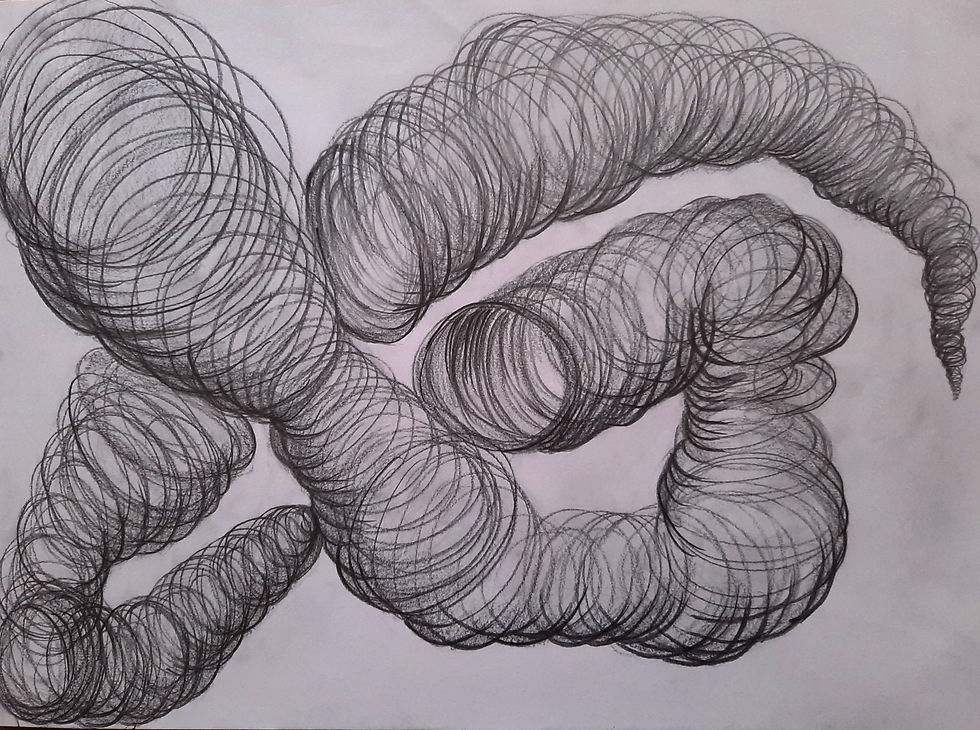
We started off with understanding Dots and Lines. On our first day we were asked to make a line bank. Just as the name suggest it was actually a 'bank where you keep your lines' as Kishor sir (one of our faculty member) mentioned during that day as well. We could make straight lines , wavy lines , curvy lines and anything in the middle. At first I was stuck because i had never given so much thought to 'lines' but eventually I just stopped thinking too hard and just drew whatever i felt like and somehow managed to fill 5 pages with it .

We proceeded with giving meaning to these lines as the day passed. We had to choose one line from the line band and depict it using dots. "Depict using dots" doesn't mean we literally had to use dots but we actually had to use circles of varying sizes. This might sound easy but trust me it wasn't. I started off with 10 depictions on one page to 10 depictions in 10 pages. As the sizes of these artwork increased so did our faculty's expectations with us. At this point i had stopped thinking as normal humans would and let my pencil take over.

As we moved on to the next day our new brief was to use this knowledge of line and represent it in the form a thematic representation. The themes given to us were:
Cloud
Rain
Rhythm
This day also marks the day i made the first, out of five, best work from the project.
The theme that i drew on was cloud. I tried to depict a heavy cloud ready to shed the water stored in it in the shape of a rain drop. I tried to build the heaviness in it by adding the big dots. The smaller dots on the side of the rain drop depicts rain or rain that is almost about to burst out of the cloud.

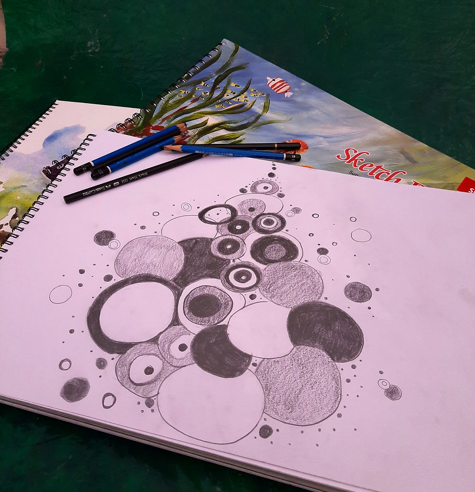
Proceeding to Day 3 we were now progressing from circular dots to square and rectangular dots. Just like we did with circles we had to choose a line from the line bank and depict it in the form of square or rectangle dots. This time it was easier than the first and there was more clarity in my mind about how to go about it. Personally for me I'm more comfortable working with squares and even I'm unaware as to why that is.
The fun thing that I tried which was new was charcoal pencil. I had never used one in my entire life and i was very excited to use it. When i started, I realized how different it is from our normal pencils. For starters it messes up the side of your hand badly and later comes the fact that its rough on paper and it smudges, A LOT! Regardless of all that i love the effect it gives on paper and i enjoyed using it.
There were 2 themes given to us on this day:
Confusion
Power


Not only did we have to do a Thematic Representation we also had to arrange these dots on the form of different shapes. I think that was a small hint from out faculty for what was awaiting us the next day.
My second best work from the project was from this day. It was a thematic representation of confusion and while making it even i got very confused.

I used Micron Tip Pen, Pencils, Charcoal Pencil and Marker for this composition. I really like the visual effect i was able to achieve for the theme as well as how i could put my thought on paper. I thought of this composition associating it to the feeling of confusion. Every time we are confused its a lost feeling and a feeling of uncertainty. There are too many things but just not the right one. However confusion paves way towards clarity. Therefore in my composition, there is the jumbled sensation and the overwhelming feeling yet there is some clarity.
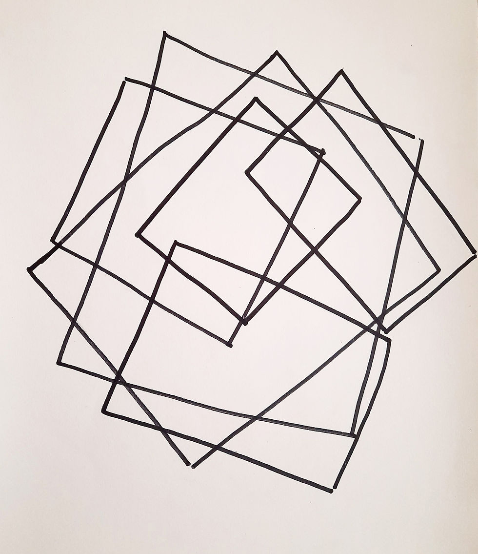
Our tutors had already given us a slight hint about what was waiting for us on day 4. We had to representing one shape with other shapes which are contrasting. The combinations were given by our tutors. We had to make:
Circles with Squares
Circles with Rectangles
Ellipse with Triangle
Ellipse with Square and Rectangle
Squares with Circles
Rectangles with Circles
Unfortunately out of all the days i faced a major technical difficulty during the day and wasn't able to interact and share my work with others. On the bright side though as my tutor mentioned as well I had a lot of time to myself and i could leave everything aside and just focus wholeheartedly on my work without stressing about uploading or showing or anything.

I was eager to show my creations but obviously couldn't hence I didn't kn ow if I was going on the right direction. I ended up making a little too many exploration or so I felt. After the technical glitches were sorted i finally was able to show all my exploration to my faculty and I genuinely thought that they would probably get annoyed with how many pages I had managed to fill. Instead they actually really appreciated my efforts, which pushed me to do better in the upcoming days. I also finally got to know what the infamous "HK" and "DK" stands for which is " Hum Khush" and "Dil Khush" and our faculty repetitively uses this but i was too embarrassed to ask them but I finally did.We also got introduced to Ink and during the afternoon session that was the only thing we were allowed to use. The only rule was to not use water.
Two of my next best work came out of the ink illustrations.
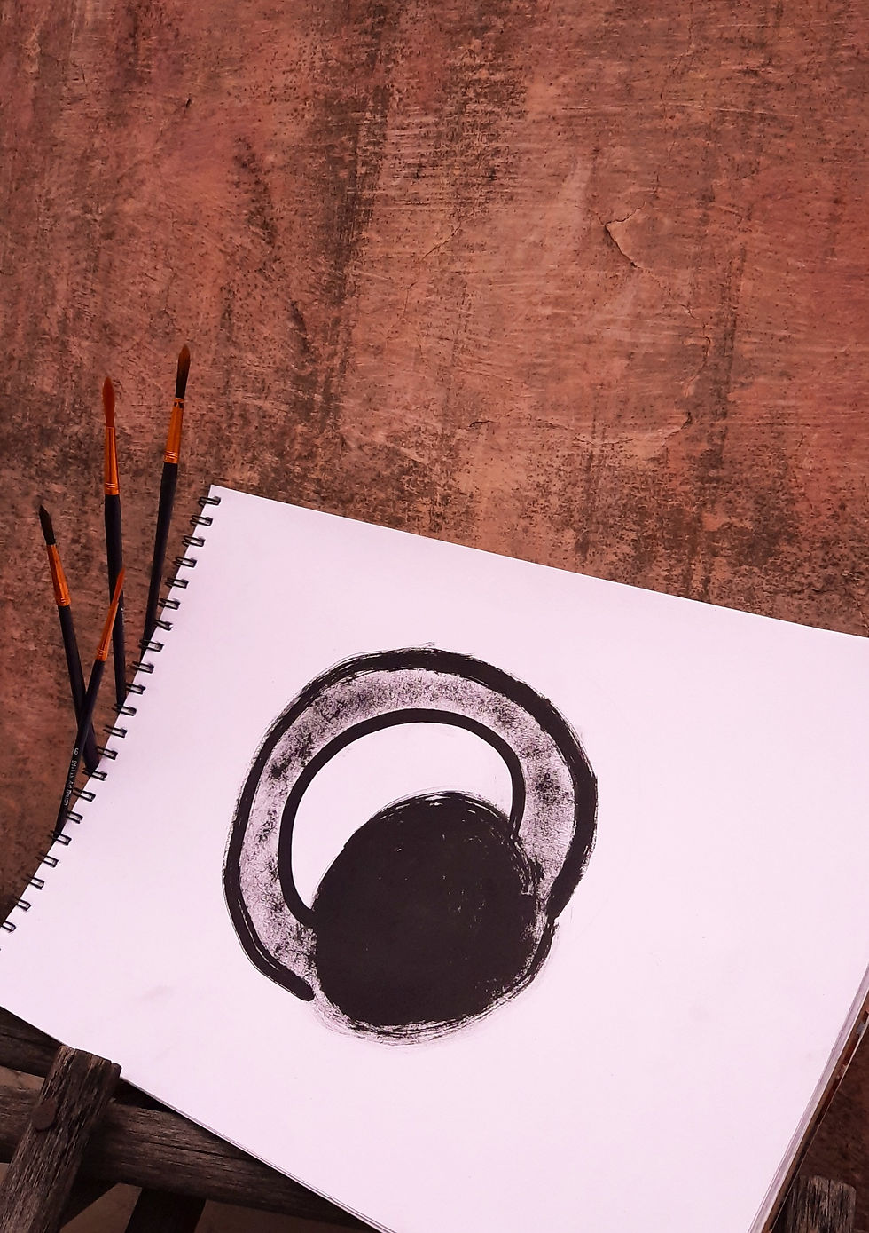

This was the first time i had used ink. The Illustration on the left was my first attempt with ink and I am surprisingly satisfies with how it came out. The one on the right is an attempt after a few tries. I personally like how visually appealing it looks. By that time I had also got the hang of ink.
As we approached the end of the project I could see how our initial learning was relevant and coming to use on Day 5 and 6 as well. Day 5 was all about explore and representing three dimensional objects with contrasting shapes.We were given 4 combinations:

Cube through Dots
Sphere through Lines
Cylinder through Squares
Pyramid and Cuboid through Circles
Unlike other briefs this one was very open ended and vague. It was time for us to use our collected understanding from the past few days. I strongly believe that because of the nature of the brief everybody including myself could create things out of the contemporary.
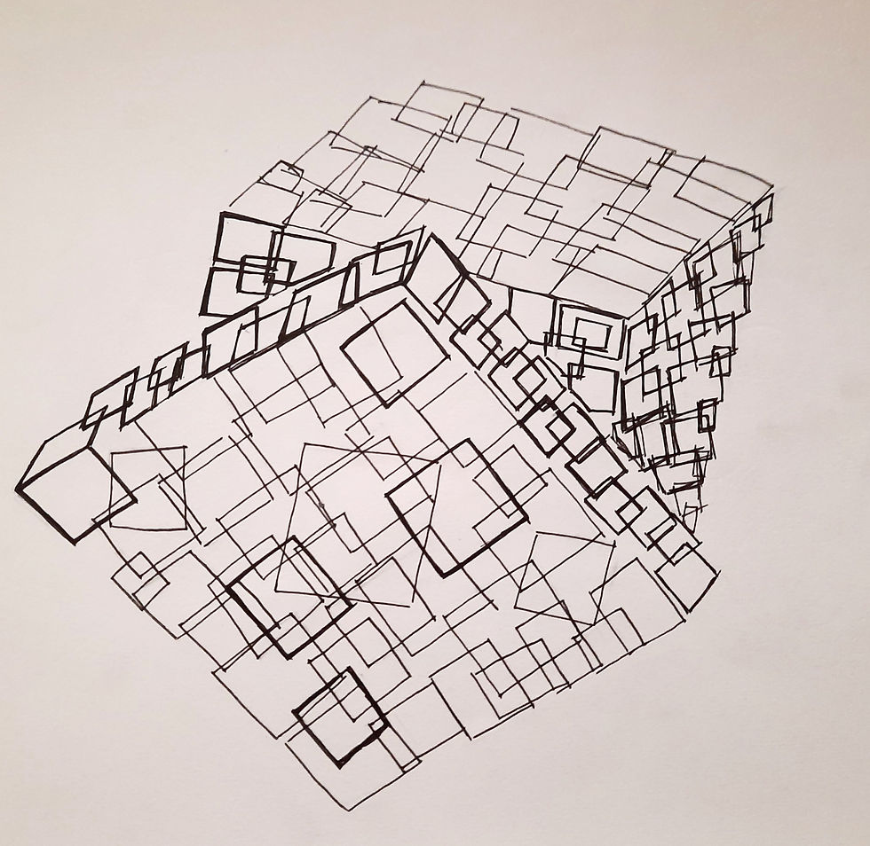
One of the most interesting things that I came up with during this day was a Rubik's cube made out of squares and rectangles. I was skeptical that I was drifting away from the brief but i still completed it and showed it to my tutor who appreciated my attempt.
On the last day of the project we had to explore and represent shapes and forms with various tones and textures using 3 mediums. We had to make:
Textures
Tones
Textures with Dots and Lines
Dimensions through tones
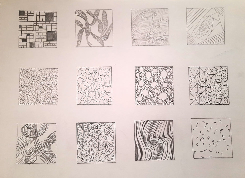
I was the most dissatisfied and frustrated while working with textures. I did not like the outputs i was producing and didn't know how to go about it and what to make. Out of all the 6 days today was the day my work production was the lowest. Even though i wasn't comfortable with textures when I started exploring textures using Ink i think i was getting somewhere. I didn't 'hate' my work but i didn't like it either but it was better than the other things I had made. I also tried ink using a sewing thread which was a hustle to work with but gave somewhat good outcomes. As I kept working with texture I did notice that i was getting a sense of clarity. I think in order to improve in this domain i need to keep exploring and practicing without giving up.
When I used brush with ink for textures i think one page of that was also my best work. During that day looking at everything I had made i was happy looking at this one page. Looking at this work gives me assurance that I can definitely do good if i could achieve this.

I really liked exploring with gradation and tones of Pencil, Charcoal Sticks and Ink. After a rough start to the day I think it was a good stress buster. I tried to show different tones between pencils of different gradations namely: 2B, 4B, 6B, 9B.
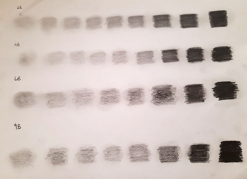
I couldn't help but notice how as the pencil progressed from 2B to 9B their darkness also increased as well as the thickness of the tip of the pencil. I think 9B would be good for shading purposes where 2B would be good for line drawing and details.
As I moved on to charcoal stick I think I got a little crazy. For the exploration on the left i used my fingers to blend because it seemed fun to do whereas on the right was simple lines and very less use of fingers. I could also see the similarity with charcoal pencil just that sticks are more vibrant I feel.

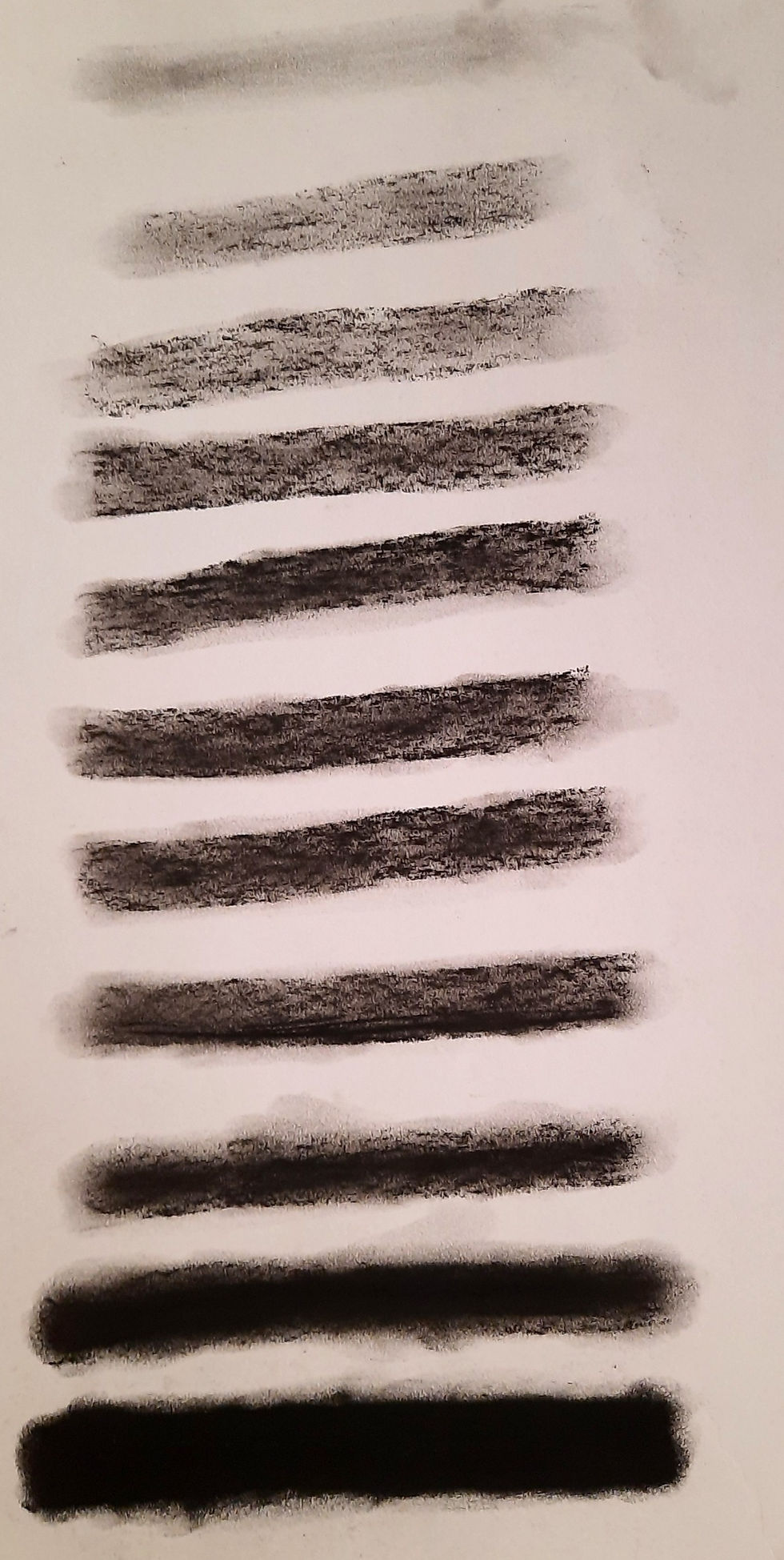
And for Ink I think It went pretty smoothly. I really liked exploring ink and try to form gradations. All I did was dip the brush in Ink once and kept applying strokes, eventually the gradation becomes lighter.

We ended the project by bring three dimensions in all the shapes we had already made with texture.

DAILY DRAWING DOCUMENTARY:
Apart from the project we had an individual project running side by side. The Daily Drawing Documentary, an on going regular and day to day activity throughout the year.
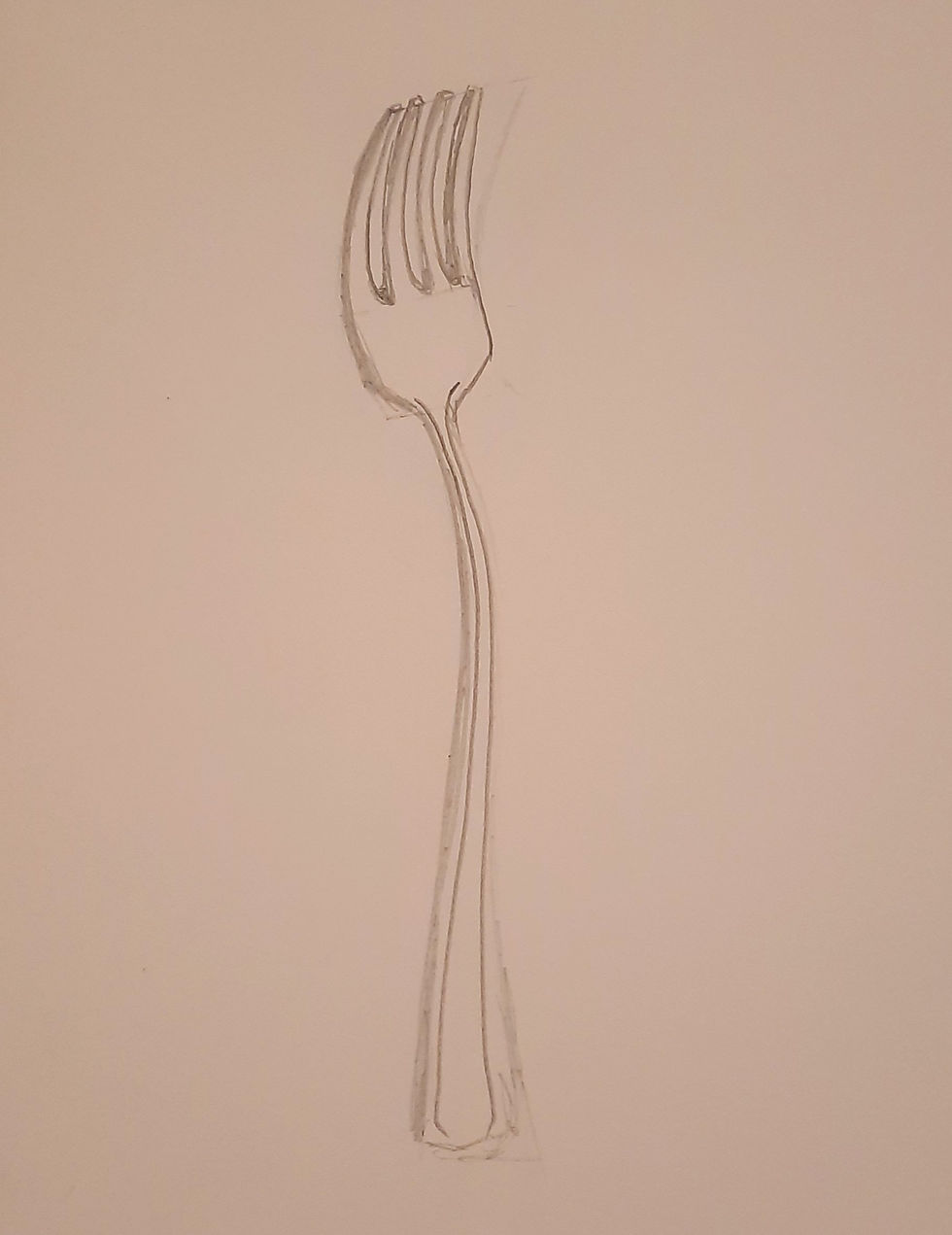
We had to start by drawing any kitchen utensil. I chose the fork. After having a talk with my tutor i learnt that i was making a wrong object. A fork is a very complex object to draw for a beginner and we had to choose a more simple one, something with a round figure. Regardless of that i personally feel that one of my best Daily Drawing Documentary was from that object.
I had spent a good amount of time observing and drawing this object and even if it isn't perfect I like the progress that I made compared to the first day. I also learnt observed a lot of curves and lines on the fork which i normally wouldn't have. I think that i got the basic structure of the fork correct and if if i drew the wrong object I think it will be useful in some place or the other.

Not all the work done in the Daily Drawing Documentary was a hit, some of them are very very silly mistakes I did and some are just made in the wrong form. I changed my object from a fork to a Mug. It seems easy to draw when you think about it, but when it comes to actually doing the drawing its not that easy. I struggled quite a bit the the form of the object specially the handle part of it. I kept making inconsistent handles throughout. It wasn't all bad either, there were some angles of the mug which I mastered in the first try but then there were some which i couldn't perfect even after multiple tries. This one particular sketch which i personally was very disappointing to see was this one. Maybe it was lack of focus that i didn't realized that the bottom shouldn't have a full circle instead a half one. I think this was completely an unacceptable silly mistake. Even the handle is disfigured and the parallel lines are curving a bit.
Regardless of the good or the bad it is all a process for the ultimate good and while we are at it might as well enjoy it.
GLOSSARY:
COMPOSITION: The placement of forms, shapes, colors, and light and dark areas in a work of art. Artists use composition to direct the viewer's eye to the most important elements of a work of art.
PLACEMENT: Objects that are placed either low or high on the picture plane seem to be closer to the viewer than objects placed closer to the eye level.
TONAL VARIATION: Tone refers to the degree of lightness or darkness of an area. Tone varies from the bright white of a light source through shades of gray to the deepest black shadows.
REFLECTION:
This project has been a roller coaster of thoughts and emotions. It might have come to an end but we are taking forward loads and loads of knowledge and memories. No doubt it was a very interesting project and the basic of sketching and uses of all the stationary from pencil to ink will be useful in the upcoming projects and activities. This is the core learning required for budding designers like use to learn to put our thoughts into a physical form on paper. Our drawing is the first medium that we can show people for them to get an insight into our mind and creative possibilities. I'm sure if the situation was different and the same was happening on campus, it would have been a hundred times better, but online classes has its own advantages and disadvantages. I myself faced technical difficulty during the project and as frustrating and annoying that was i think it was beneficial for me at the end of the day. After all unless you try to do something beyond what you have already mastered you will never grow.

Comments