Fundamentals Of Visual Language-2: Learners Journey Log
- Poulomi Sen

- Oct 25, 2020
- 2 min read
Updated: Nov 29, 2020
ILLUSTRATED GLOSSARY
Contour Drawing: Outline drawing of an object.

Achromatic Color: Single color.

Complimentary Colors: Colors opposite on the color wheel.

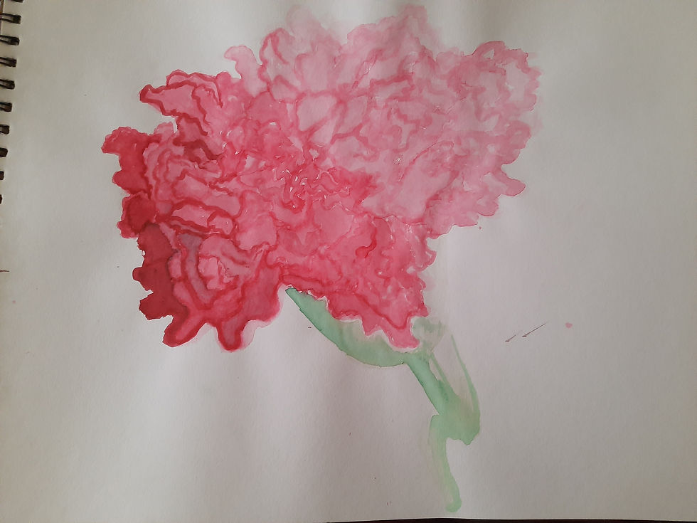
(The flower I chose was pink in color and its complimentary color is green.)
Sepia Color: A reddish-Brownish-Green color derived by mixing sap green and burnt sienna .

DRY PASTEL
They consist of strong pigment just like in oil pastel but they are more powdery in consistency. The color produced is hence very vibrant and intense and can cover large surfaces. Due to its powdery property it has high blending nature.

Advantages
Mixing 2 colors is very easy.
The color, if used correctly, can give close to realistic results..
Easy to use
Gives a glossy finish to artwork.
Challenges
Messy to work with. Gets all over your hand, clothes, work station, etc.
People with sensitive nose can have problems because of the powder.
Easily smudges.
WATER COLOR
This color had the ability to manipulate the opacity and transparency of the color. The color is mixed on the palette and water is added to get the desired consistency. The darker the consistency the lesser water to be used and vice versa.

Advantages
Water color is the least damaging to paint brushes.
Paint is not wasted as only a small amount is required to which water is added.
Transparency and intensity of the pigment can be manipulated.
Gives a matt finish to artwork.
Neat to work with.
Challenges
If the right paper is not used then the water can result to the paper getting wrinkled.
The color is less vibrant.
Blending is not as easy.
I personally feel that dry pastel gives more desired outcome. It makes the artwork more vibrant and lively as oppose to water color. The pastels are easy to use by hand even though sometimes it can get messy. With soft pastel you can change the look of the color as you go with the artwork, as compared to water color where you need to mix the color on a palate without knowing about how it would look on paper.
Do's and Don'ts
Never add black to give depth to your artwork.

2. Don't be afraid to use your fingers to blend the color instead of drawing harsh lines.


3. Use a darker shade of the same color to give depth to your artwork.

4. Don't be afraid to fill the color in

5. Make sure to wash your hands and get the color off before starting to work with another color.
6. Lastly, keep blending till you get the desired result's.

Comments